Planned Parenthood Prepared
An individualized hub for patients to prepare for their appointments at Planned Parenthood.
Solve a service design challenge during an 8-week design sprint for an academic project. In a team of 4, we chose to focus on health and wellness to redesign the waiting room experience for Planned Parenthood.
UX/UI Design
Role
I worked closely on both the research and design phases of the project. I conducted surveys that received nearly 200 responses and designed the initial low-fidelity screens as well as the polished high-fidelity screens for the prototype interface.
Problem & Opportunity
The main problem we identified is that there is no streamlined platform for patients to access information personalized to them. Instead, the search for information is scattered across different platforms.
How might we rethink the Planned Parenthood waiting room experience so patients feel informed, reassured, and prepared while waiting for their service?
Solution
To bridge this gap, we created an individualized hub for patients to access information at the right place and time.
Patients will receive nudge texts with a link to learn more about their appointment with curated information based on their health services.
Key Outcomes & Results
Design Insights
We conducted user testing with three different Planned Parenthood patients. When asked about how anonymous the reminder texts should be, one user said,
“Thinking about people in other situations where maybe they don’t live in a safe environment, keeping it more vague is protecting the safety of the patients.” - Chandelle
People want to fill out forms prior to their appointments
Consider the tone of language we use to be aware of people's mixed emotions they could be experiencing during their appointment
Future Considerations
Unique Access Code
We would like to build more security to our interface by providing patients with a unique code to access their personalized appointment page via email.
Online Forms
Another thing we’d love to tackle is how to fill out medical forms in advance. From our user testing, almost every person said they would be most interested in this feature because they would love to get it out of the way before their appointment and to save check-in time.
Payment and Insurance Costs
We want to create something to make payment and insurance cost easier for the patients to navigate. One patient we interviewed shared a story with us about how she wished she was informed about different payment resources Planned Parenthood offers like family pact and student discounts for those who can’t afford to pay out of pocket. She wishes there was a cost calculator and easily found page with all those payment resources available.
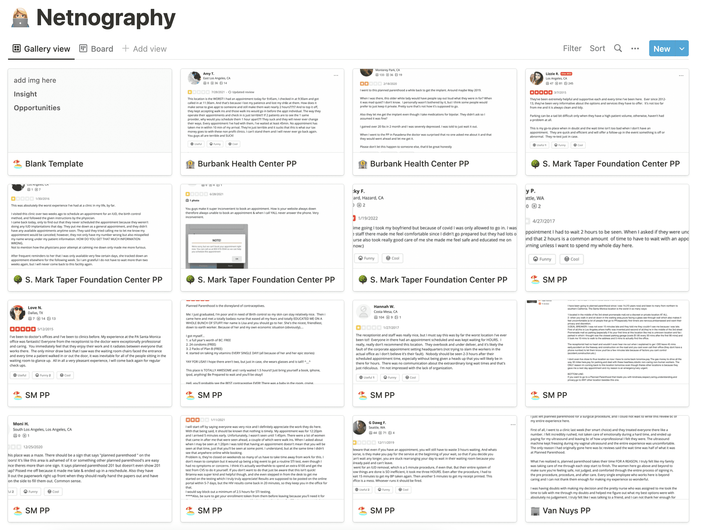
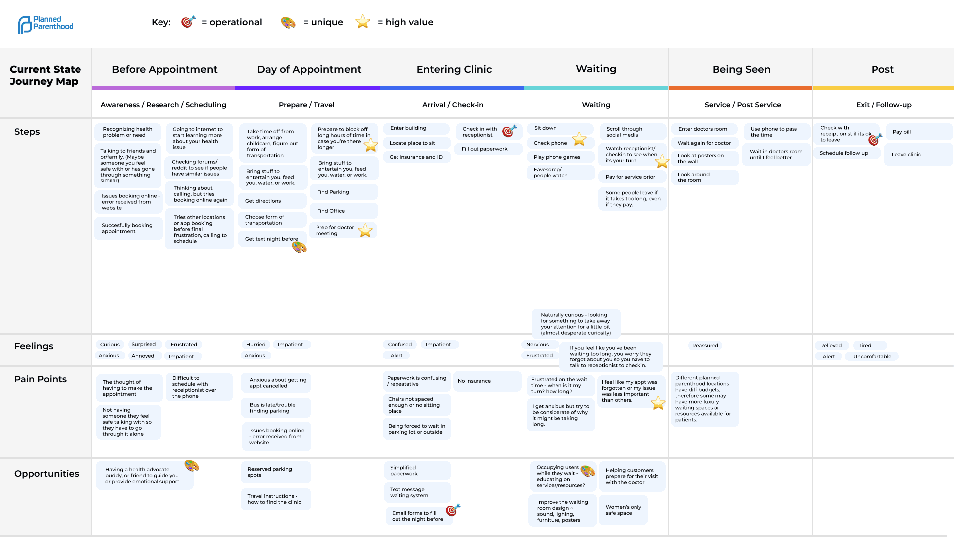
Research
Insights
Delivering Relevant Information at the Right Time
One challenge we ran into is how to organize this information to prevent cognitive overload. We tailored the information based on when it would be most relevant and useful for them.
Ensuring Privacy for Planned Parenthood Patients
Many of Planned Parenthood’s patient demographics include 18 - 24 year olds who don’t want their parents or partners finding out about their appointment. From our user testing we discovered that patients want to leave a minimal digital trail and worry less about their privacy.


Final Prototype


